
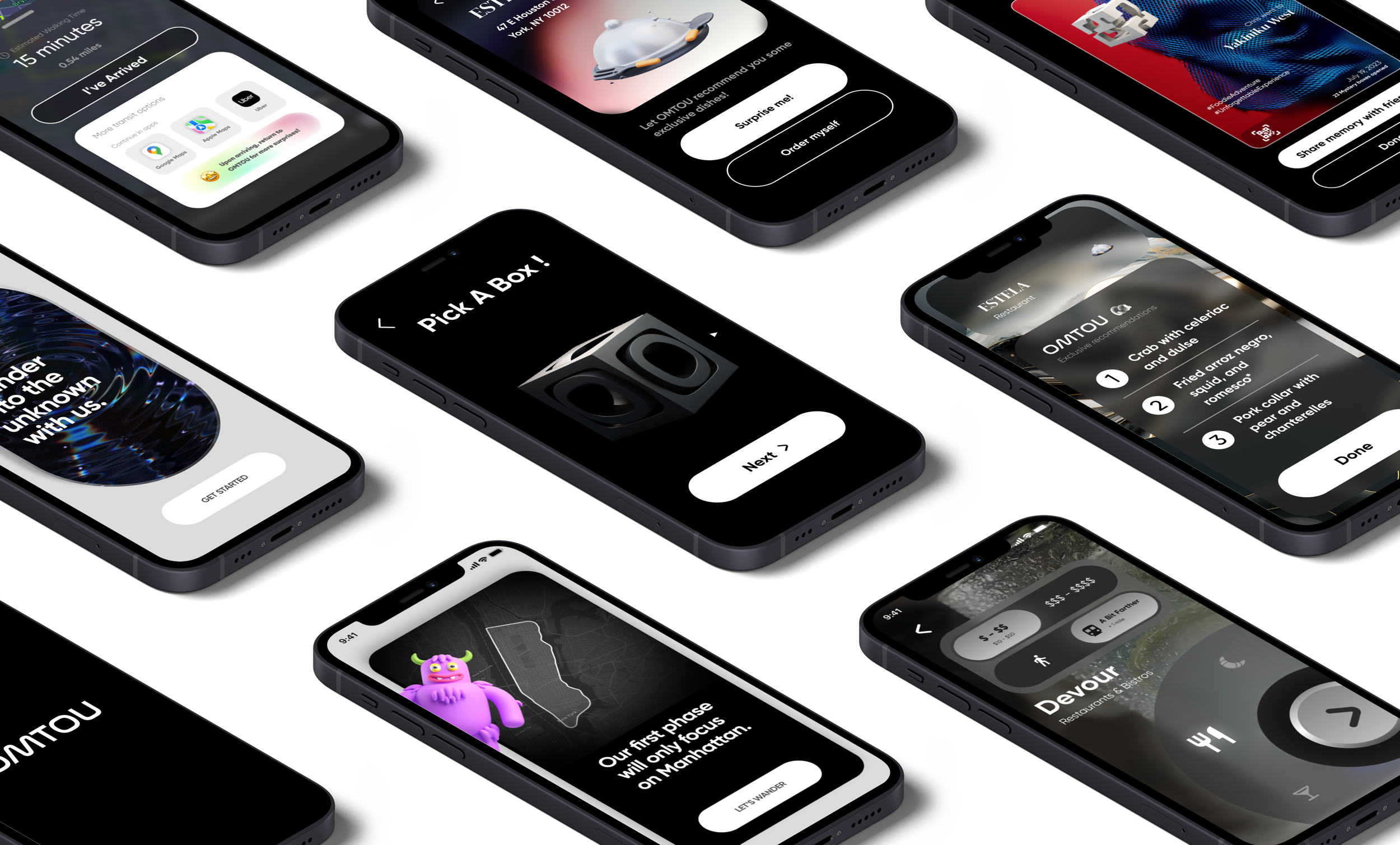
What is


OMTOU is a unique iOS app that aims to transform the way we explore NYC and discover new locations . Through a series of simple user inputs, the algorithm introduces you to destinations around the city, each guiding you toward a unique culinary and cultural experience.
My role
In 8 weeks, I worked closely with the founder, a co-designer and engineers to redesign the entire UX flow of the app, adding key screens such as onboarding, activity selection and navigation, and solidifying OMTOU’s brand identity and visual language.

Role: Product Designer
Type: Launched iOS App
Duration: 2 months
Tools: Figma, Midjourney
Team: 2 Designers, 6 SWE, 1 PM
A new type of location discovery app

Research
Oversaturation of locations and decision fatigue.
We sent out a survey to over 130 New Yorkers to understand how they discover new places around the city and thoughts on existing review apps.
35% of respondents mentioned feeling overwhelmed with choices on platforms such as Google Maps and Yelp, leading to decision fatigue. At the same time, 31% of users noted that popular spots tend to get overcrowded quickly, while smaller, hidden gems are often overlooked.
To help establish specific filters for restaurant finding, we used the survey as an opportunity to understand what users truly cared about. Asking about their preferred budget range informed that we will need a low and high bracket. Most people preferred a location 10-20 min away so we knew proximity was important. Lastly, atmosphere of the space was amongst the top considerations for a restaurant/bar.


Filter Options
Budget
Proximity
Atmosphere
Ideate
Budget, Proximity and Atmosphere
With the three key selection elements solidified, we began sketching out the main screens, with the filter screen being the main focal point of the user journey. To gamify the process even more, we added a mystery box that the user selects before receiving their customized destination.


The Problem
Crafting a complete user journey
When I was onboarded, the app worked but a lot of the core functionalities envisioned were missing. For instance, there was no onboarding to properly introduce users to this novel experience and no user control over the type of destinations they received. Moreover, users had to exit the app in order to use third party navigation in order to reach their destinations, adding friction to the experience. So I was responsible for crafting those missing screens and connecting all the pieces of the experience together.
Onboarding
Inviting users onboard through friendly mascot
My first action item was to design a set of inviting onboarding screens to welcome new users to our app. These initial screens invite users to “dive” into the experience without revealing too much functionality.
We chose to include a friendly mascot here as our first point of contact to build a more human connection, greeting our users with a warm message accompanied by vibration haptics mimicking that of a human heartbeat.
Activity Selection
Decision fatigue is very real and with no many restaurant and destination options to choose from in NYC, users can often get overwhelmed. Giving only two simple toggles for distance and budget allows for some user preference while keeping the overall experience spontaneous.
We crafted 6 unique categories to cover an array of activities and destinations across the city, catering to user’s different moods and cravings.
Limiting the amount of choices user have to make
Devour
From cozy local grubs to fine dining establishments.
Nibble
From corner patisseries to specialty ice cream parlors
Tipsy
From neighborhood pubs to hidden cocktail bars.
Savor
From charming coffeehouses to artisanal espresso bars
Provoke
From immersive museums to avant-garde galleries.
Curios
From trendy boutiques to exotic spice shops.
Circular selection wheel
Old layout
Redesigned layout


The circular motif remains a core identifier of the OMTOU branding and carries over into the activity selection interface as well. The placement of the selection wheel in the bottom right corner allows for ease of swiping through the categories with one hand.


Navigation

Initially relying on Apple Maps to guide users to their surprise destination, we prototyped an in-app navigation screen that offers real-time location data and estimated arrival time while keeping the option to use a third-party app if they wish.
A large part of OMTOU’s design philosophy and appeal lies with its mysteriousness. While on the navigation screen, not only is your destination name hidden, but all relevant information is also revealed in layers.
Revealing information in layers
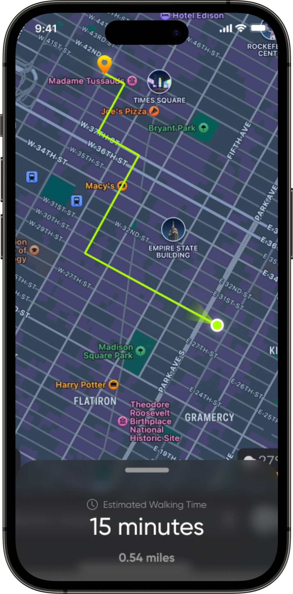


Different card heights displaying varying levels of information
Ensuring users’ return to the app
Part of the design challenge was making sure users returned to OMTOU after arriving at their destination in order to complete the experience. Therefore, we displayed additional instructions before revealing the third-party links.
Share with Friends
Exploring new restaurants and bars with friends is all about the memories created. At OMTOU, we're giving users the chance to take a piece of their journey home, whether to share on social media or keep as a personal memento. Our app provides a snapshot of their adventure upon arrival at their destination, featuring details like the date, merchant name, mystery box, and a category-specific AI-generated background.
These postcards are designed to be visually enticing, encouraging users to share their experiences and engage with others. By doing so, we aim to foster a vibrant online community around the excitement of discovering the unknown with OMTOU.
Capture your adventure

My Takeaways

1. Products are constantly evolving, especially in startups
OMTOU is still quite a ways away from what it sets out to be. Crucial business considerations such as how to monetize the product and proper marketing campaigns are amongst the most urgent issues that will unfortunately outlive my time on the team. Just like a company’s business model, its product will undoubtedly undergo numerous changes and iterations throughout its lifecycle and it’s important for design to adapt to these new factors and adjust accordingly.
2. When to be detail-oriented and when not to be
At times, it’s about pushing out quick prototypes to test if a solution is viable while sometimes it’s about really finessing the details of a particular screen. Regardless of the situation, the dev team will almost always push for design and it is up to the designers to provide the right complexity level of instruction with the right degree of fidelity at the right time.
3. Communication makes the dream work
But the way in which those instructions are conveyed also plays an often overlooked role in how your design is received. In order to deliver a successful product, the engineers and designers need to be on the same wavelength and speaking the same language. At the end of the day, engineers are humans and some may even end up becoming your friends, as in my case. And people always receive criticism better and give better feedback when they know their voices are being heard.
Thank you for checking out my work! Here’s more where that came from:
UX/Product
OMTOU: Subverting Urban Exploration
XR
Tangible